From Figma to Production: Building Design Systems That Developers Actually Use
Learn how to turn a polished Figma library into a production-ready design system that engineers trust and actually ship. Over 6 weeks, you'll build a real component library with tokens, governance, documentation, and release workflows, then publish it to npm with a portfolio-grade docs site that proves you can bridge design and code.
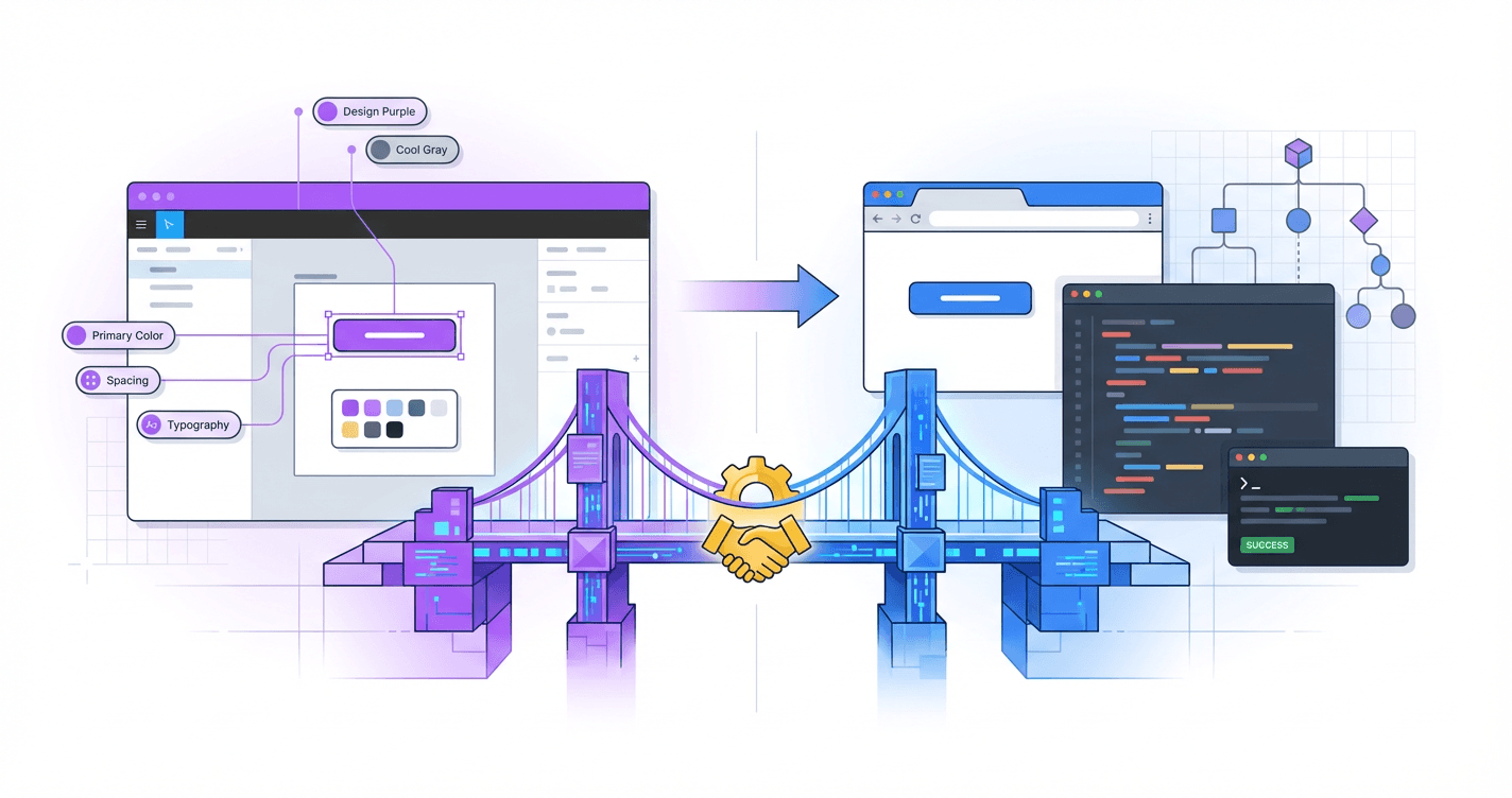
Your designs look perfect in Figma, but somehow they ship looking like a completely different product--and developers keep pinging you with questions you don't know how to answer. The gap between design and code is quietly killing your influence, your impact, and your shot at those senior roles that actually require systems thinking. This course teaches you to build design systems that developers will actually implement, respect, and maintain--without becoming a full-stack engineer or abandoning what makes you a great designer.
What Students Say
Hear from learners who have completed this course:
Adaeze O.
Staff Product Designer, Fintech (Design Systems Lead)
I’d been maintaining a “pretty” Figma library that nobody used because engineers didn’t trust it. Section 1 (why systems fail) hit a little too close to home, and the fixes were practical: we rewrote our contribution model and set a clear component taxonomy from Section 2 (foundations + UI architecture). The biggest win was Section 3—design tokens that survive the handoff. I followed the token structure and naming guidance, mapped tokens to code, and we automated updates from Figma so we stopped arguing about hex values in PRs. Within 6 weeks, we shipped a v1 library with tokens + core components in Storybook (Section 4) and a docs site that designers can actually maintain (Section 6). Our adoption went from “two teams sometimes” to 6 product squads using the same button/input patterns, and I cut design review time by ~30% because we finally had a shared source of truth and a change log everyone respected (Sections 5 and 7).
Read more
Ravi N.
Frontend Engineer (React), B2B SaaS
I joined this course to understand why our design system repo was a graveyard of half-finished components. The collaboration workflow section (Section 5) was the turning point: semantic versioning rules, quality gates, and how to handle breaking changes without freezing the whole org. I implemented the suggested PR checklist + required Storybook build checks, and we added a simple “RFC” template from the governance module (Section 7) so designers and devs stop talking past each other. On the build side, Section 4 helped me structure components in Storybook with clearer props, states, and accessibility notes—things that weren’t consistently captured in Figma. After the production release section (Section 8), I published our package to npm internally and set up a docs deployment pipeline. Result: onboarding new engineers is faster (we point them to the docs + examples instead of Slack threads), and our UI bugs around inconsistent spacing/typography dropped noticeably once we wired in the token-based spacing scale from Section 3.
Read more
Leila B.
UX Engineer, Healthcare Platform
My background is half design, half code, so I’m usually the “translator” in meetings. This course gave me the structure to make that role sustainable. Section 2’s component taxonomy and UI architecture helped me untangle our messy “components vs patterns vs templates” debates. I used the course framework to split what belonged in the core library vs what stayed product-specific, which immediately reduced the number of one-off components engineers felt pressured to support. Section 6 (documentation engineers trust) was incredibly actionable. I rebuilt our docs to include usage guidance, do/don’t examples, and decision rationale—plus a lightweight maintenance workflow so designers can update content without touching the code. Then Section 8 walked me through packaging and deploying a portfolio-grade docs site; I used that exact flow to ship our system as a versioned npm package with a public-facing Storybook. Concrete impact: we standardized form controls across three apps, improved accessibility compliance on inputs and error states, and cut the time it takes to implement new screens because teams now start from documented, tested components instead of reinventing them.
Read more
Course Overview
Learn how to turn a polished Figma library into a production-ready design system that engineers trust and actually ship. Over 6 weeks, you'll build a real component library with tokens, governance, documentation, and release workflows, then publish it to npm with a portfolio-grade docs site that proves you can bridge design and code.
Section 1: Why Design Systems Fail and How to Build One People Adopt
You'll start by diagnosing the real reasons design systems break down: unclear ownership, mismatched goals between design and engineering, and documentation that doesn't map to real code. You'll define the scope, success metrics, and adoption plan for the design system you'll build throughout the course.
Learning Outcomes:
- Identify common failure modes (Figma-only systems, "UI kits" without APIs, token chaos, and governance gaps) and how to prevent them
- Define the right level of system scope for a team size of 50-500 (what to standardize now vs later)
- Create an adoption strategy with measurable outcomes (reuse targets, cycle-time reduction, consistency metrics)
You've spent weeks perfecting the border radius on your cards. You've organized your Figma variants into a pristine grid. You hand it off to engineering with high hopes, but three weeks later, the production build looks... off. The shadows are too dark, the padding is inconsistent, and there are three different hex codes for your primary blue.
You didn't build a design system; you built a UI kit. And there's a massive difference.
According to the State of Design Systems benchmark, nearly 60% of design systems created in organizations today are abandoned or deprecated within two years. They don't fail because the components aren't pretty. They fail because they remain static artifacts in a designer's tool rather than living infrastructure in a developer's codebase.
In this course, we are not just making a UI library. We are bridging the "Valley of Death" between a pixel-perfect mockup and a React component API. We're building a system that serves two users: the designer who needs flexibility and the developer who needs reliability.
Diagnosing the "Graveyard": Why Systems Break Down
Before we write a single line of code or define a token, we must understand the failure modes. Most systems die a slow death due to one of three specific disconnects.
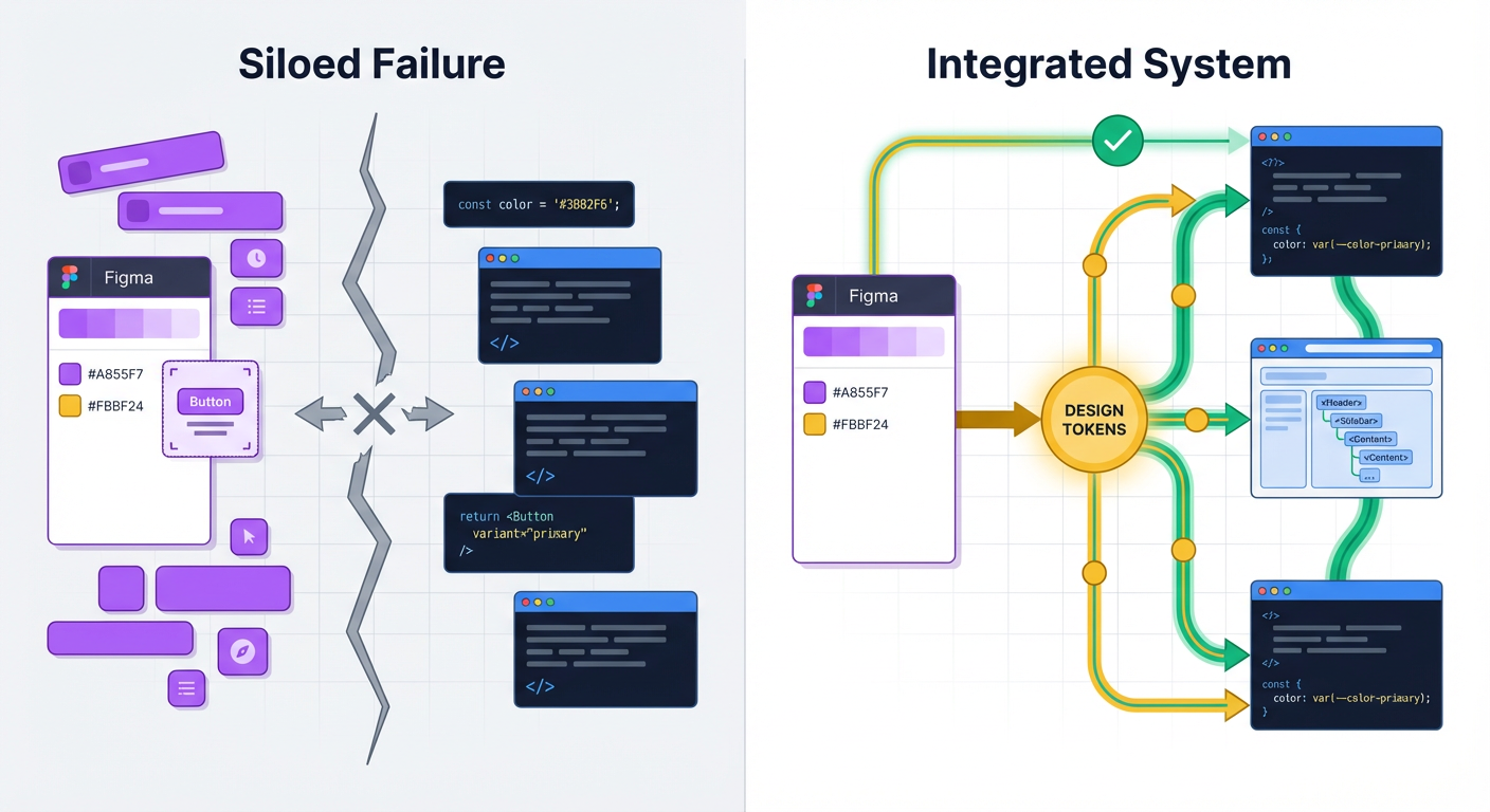
1. The "Figma-Only" Fantasy
This is the most common trap. You treat the Figma file as the "Source of Truth." But the browser doesn't render Figma nodes; it renders DOM elements and CSS. If your system exists only in design software, developers have to interpret your intent every single time they build a feature. This interpretation gap is where inconsistency thrives.
2. The Token Tower of Babel
You call it Neutral / 500. The developer calls it $grey-dark. The iOS team calls it UIColor.cement.
When naming conventions don't match 1:1 between design and code, you create cognitive load. Every time a developer has to translate your design token into their variable name, you introduce friction. Eventually, they stop looking up the variable and just hardcode a hex value to save time.
Key Insight: A design system is not a project; it is a product serving internal customers. If the "product" (your system) is harder to use than the alternative (hardcoding values), your customers (developers) will churn.
3. Governance Gaps
You launch the system, but who maintains it? When a designer detaches an instance in Figma because the component "didn't quite work," that feedback rarely makes it back to the system maintainer. Without a clear contribution model--how to request changes, how to report bugs, and how to version changes--the system becomes a bottleneck rather than an accelerator.
Right-Sizing Your Scope: The "Minimum Viable System"
A common mistake in companies with 50-500 employees is trying to clone Salesforce's Lightning or Google's Material Design immediately. Those systems support thousands of engineers. You likely don't need that level of complexity yet.
To ensure adoption, you must deliver value quickly. We'll focus on a Minimum Viable System (MVS). This approach prioritizes elements that provide the highest ROI for engineering efficiency.
Scope Strategy for Team Sizes 50-500
| Component Category | Standardize NOW (The MVS) | Standardize LATER (Scale Phase) |
|---|---|---|
| Foundations | Color (semantic names), Typography scale, Spacing (grid/layout), Shadows | Motion curves, Sound, Illustrations, Complex iconography sets |
| Core Components | Button, Input, Checkbox/Radio, Modal, Tooltip, Card | Date Pickers, Rich Text Editors, Complex Tables, File Uploaders |
| Documentation | Installation guide, Props table (API), "Do/Don't" usage examples | Interactive playgrounds, automated changelogs, contribution guidelines |
| Technical Stack | CSS Variables (Tokens), Component Library (React/Vue) | Snapshot testing, visual regression testing, CLI tools |
By focusing on the "Standardize NOW" column, you cover approximately 80% of the UI surface area with 20% of the effort. This allows you to ship the system faster and start gathering adoption metrics.
Creating an Adoption Strategy That Works
Adoption isn't achieved by sending a slack message saying, "Here is the new system, please use it." Adoption is achieved by solving problems for your developers.
If you are a designer, you need to understand what makes a developer reach for a library. Developers care about predictability and speed. If your system forces them to write messy overrides to get a button to look right, they will abandon it.
Pro Tip: The fastest way to gain engineering adoption is to write the documentation first. Before you design the Figma component, sit with a developer and agree on the "API"--what props will the component need? What states (loading, disabled, error) must be handled?
Defining Success Metrics
To justify the investment in this course and your future work, you need to measure success. Avoid vanity metrics like "number of components." Instead, focus on operational efficiency.
Three Metrics We'll Target:
- Detach Rate (Design): In Figma, how often are designers detaching components to make changes? A high detach rate indicates your system lacks necessary flexibility.
- Grep Test (Code): If you search the codebase for specific hex codes (e.g.,
#3B82F6), how many results come up? Ideally, this number should trend toward zero as hardcoded values are replaced by semantic tokens (e.g.,color-action-primary). - Onboarding Velocity: How long does it take a new hire to ship their first UI feature? A good design system should act as a guidebook, reducing the need for junior staff to ask seniors basic implementation questions.
Your Course Roadmap
Over the next six sections, we're going to build a system that stands up to these challenges. We won't just draw rectangles; we'll build infrastructure.
- Section 1 (Here): Strategy and Scope.
- Section 2: Design Tokens--The DNA of your system.
- Section 3: Component Architecture--Designing logical APIs.
- Section 4: Tooling--Setting up the repo, Storybook, and npm.
- Section 5: Documentation--Automating the guide.
- Section 6: Release & Governance--Versioning and maintenance.
Important: This course requires you to step out of your comfort zone. If you are a designer, you will touch the command line. If you are a developer, you will critique visual hierarchy. This cross-disciplinary friction is where growth happens.
Coming Up Next: The DNA of Design
Now that we understand why we are building this, we need to define the fundamental atoms of our universe. In the next section, "Mastering Design Tokens," we'll move away from static hex codes and pixel values.
You will learn how to architect a multi-tiered token system (primitive vs. semantic) that allows you to change your product's entire branding with a single line of code--and how to automatically sync those decisions from Figma variables directly to CSS.
Section 2: Shared Foundations: Principles, UI Architecture, and Component Taxonomy
You'll establish the system's design principles and translate them into a component taxonomy that works in both Figma and code. Designers learn to think in states, constraints, and accessibility; developers learn to reflect visual intent in component structure and API shape.
Learning Outcomes:
- Produce a component inventory and taxonomy (foundations, primitives, components, patterns) that maps cleanly to a codebase
- Specify component states and interaction behavior in a way that reduces developer clarification requests
- Align on accessibility and UX quality bars (focus states, keyboard navigation, color contrast) as non-negotiable requirements
In Section 1, we dismantled the reasons why design systems fail--usually because they are treated as static artifacts rather than living products. Now, we move from strategy to structure.
The friction you feel during handoff--where the developer asks "what happens when this text is too long?" or "what is the focus state for this input?"--usually stems from a lack of shared foundations. When design and development speak different languages, the product suffers.
In this section, we will define the taxonomy of your system. We are going to standardize how you name, organize, and categorize UI elements so that the Figma sidebar matches the codebase file structure 1:1.
The Anatomy of a Component Taxonomy
A robust taxonomy is not just about sorting layers; it's about creating a mental model that scales. If a designer calls it a "Dropdown" and a developer calls it a "Select Menu," you have already introduced technical debt.
We will adopt a three-tier taxonomy that works universally for both React/Vue environments and Figma component libraries.
Key Insight: A shared taxonomy is your first line of defense against inconsistency. If you cannot agree on what to call a component, you will never agree on how it should behave.
1. Primitives (The Atoms)
These are the lowest-level building blocks that cannot be broken down further without losing meaning. They rarely have complex logic.
- Design: Icons, Design Tokens (Colors, Typography, Spacing), Avatars, Badges.
- Code: HTML elements wrapped in styles (
<Box>,<Text>,<Icon>).
2. Base Components (The Molecules)
These are functional UI elements composed of primitives. They have defined states and interactions.
- Design: Buttons, Input Fields, Checkboxes, Tooltips.
- Code: Reusable components with defined API props (
<Button variant="primary">).
3. Patterns (The Organisms)
These are specific arrangements of components to solve a user problem. They often rely on business logic.
- Design: Login Forms, Data Tables, Cards, Navigation Bars.
- Code: Compositional components that manage state (
<LoginForm>,<GlobalNav>).
Mapping Figma Variants to Component APIs
For the career-transitioning designer, this is the most critical skill to master: Thinking in APIs.
When you create a component set in Figma, you define "Properties." In code, developers define "Props" (properties). These should match exactly. If your Figma button has a property called Type with values Primary and Secondary, the code implementation must not use Style="Blue" and Style="Gray".
The Translation Layer:
| Figma Concept | Code Concept (React/Vue) | Practical Application |
|---|---|---|
| Component Name | Component Name | Stick to PascalCase. PrimaryButton in Figma = <PrimaryButton /> in code. |
| Variant Property | Enum Prop | A limited list of options. E.g., Size: Small, Medium, Large becomes size="small". |
| Boolean Property | Boolean Prop | True/False toggle. E.g., Has Icon: True becomes hasIcon={true}. |
| Text Property | String Prop | The content inside. E.g., Label: "Submit" becomes label="Submit". |
| Instance Swap | Component Prop / Slot | Swapping an icon inside a button becomes passing an icon component as a child. |
Pro Tip for Developers: When setting up your component library, sit with your designer and agree on the
propsinterface before writing the CSS. If you align the API first, the visual implementation becomes a detail rather than a structural blocker.
The Matrix of Component States
A static mockup usually represents the "Happy Path"--the ideal scenario where data loads instantly, user inputs are correct, and strings are short. Real software is rarely this polite.
To reduce developer clarification requests, you must design for the State Matrix. For every interactive component (Inputs, Buttons, Cards), you must define:
- Default/Rest: The initial state.
- Hover: The cursor is over the element (desktop only).
- Focus: The element is selected via keyboard or voice (critical for accessibility).
- Active/Pressed: The moment of interaction.
- Disabled: The element exists but cannot be interacted with.
- Loading: The system is processing an action.
- Error: Validation has failed.
- Empty: No content is available yet.
If you hand off a design without an error state for a form field, you are forcing the developer to "design in code," which leads to inconsistency.
Accessibility as a Non-Negotiable Constraint
Accessibility (a11y) is often treated as a post-launch cleanup task. In this system, we treat it as a foundational constraint. We do not ship components that fail basic a11y standards.
Focus Rings are UI, Not Bugs
Designers often remove the default browser blue outline because "it looks ugly." However, without a focus indicator, keyboard users (including power users and those with motor impairments) cannot navigate your site.
The Rule: You can remove the default browser outline only if you replace it with a custom focus state that meets the 3:1 contrast ratio against the background.
Structure and Semantics
For developers, this means using the correct HTML tags. A <div> with a click handler is not a button.
- Buttons (
<button>) are for actions (Submit, Cancel, Delete). - Links (
<a>) are for navigation (Go to profile, Read more).
Mixing these up ruins the experience for screen readers and breaks expectation patterns for everyone.
Principles in Practice: Establishing "The Why"
Before we start building tokens in Section 3, we need to agree on why we make certain choices. Design principles act as tie-breakers when two team members disagree.
Avoid generic principles like "Simple" or "Clean." They are subjective. Use principles that force a trade-off.
Example Principle: Clarity over Density
- What it means: We prefer more whitespace and larger touch targets, even if it means less data on the screen at once.
- The Trade-off: We accept that users may have to scroll more.
- System Impact: Our spacing tokens will start at
4pxbut scale aggressively (16px,24px,32px) to encourage separation.
Example Principle: Predictability over Novelty
- What it means: We use standard patterns (like standard placement for "Close" buttons) rather than inventing new interactions.
- The Trade-off: The UI might feel less "unique" or "flashy."
- System Impact: We use standard browser behaviors for scrolling and inputs rather than custom JavaScript overrides.
What You'll Build On:
This section lays the groundwork. Here is how these concepts expand in the rest of the course:
- In Section 3 (Design Tokens): We will take the "Taxonomy" we defined here and turn it into JSON data (Design Tokens) that power both Figma variables and CSS variables.
- In Section 4 (Component Build): We will open VS Code and build the "Button" and "Input" components using the exact API structure and States Matrix we defined in this section.
- In Section 6 (Governance): We will create the contribution guidelines that enforce the Accessibility standards we just established.
Conclusion
By the end of this module, you should have a spreadsheet or a Notion doc listing every component you intend to build, mapped to its atomic category, with a list of required states for each.
For the designers, this taxonomy is your shield against "that's not possible" arguments. For the developers, this taxonomy is your blueprint for a clean, modular codebase.
This architectural work is not glamorous, but it is the difference between a design system that scales and a UI kit that collects dust. Once we have our map, we are ready to start defining the mathematics of our system--Design Tokens--in the next section.
Ready to stop guessing and start building? The full course moves beyond theory into the actual code and Figma files. In the upcoming sections, you will watch over my shoulder as we write the React components, set up the Storybook documentation, and automate the publishing workflow. We'll stop talking about systems and start shipping one.
Course Details
- Sections8 sections
- Price$9.99